Square Cloud Design System
Our visual identity, brand guidelines and resources for developers and partners.
Our Brand
Discover the meaning and identity that reflect our values.
The Two Squares
Square Cloud's logo consists of two squares positioned at a specific angle, forming a structure that evokes the shape of a Docker container.
Symbolism
Solidity and Reliability
The two squares represent a solid and robust foundation.
Flexibility and Scalability
The container shape evokes adaptability and growth.
Primary Logo
The main variation of our logo. Use it in your projects and communications.

For dark backgrounds
Use on dark or neutral backgrounds

For light backgrounds
Use on white or light backgrounds
Primary Logo Download
Available in multiple formats. Choose .svg for maximum scalability or .webp for better compression.
Logo Icon (No Text)
Compact version ideal for favicons, small avatars and applications where space is limited.

Icon for dark backgrounds
Symbol only, no text

Icon for light backgrounds
Symbol only, no text
Downloads
Available in multiple formats. Choose .svg for scalability or .png for better compatibility.
Special Variations
Rounded Logos
Ideal for avatars, app icons and platforms that require rounded edges.

Fully Rounded
100% rounded corners

Semi-Rounded
Slightly rounded corners
Correct Usage Guide
Follow these guidelines to maintain the integrity of the Square Cloud brand
What to Do
Minimum Spacing
Always maintain a minimum space around the logo
Vector Files
Always use the original SVG or WEBP versions
Official Colors
Respect the exact defined brand colors
Original Proportion
Always maintain the original logo proportion
What to Avoid
Don't Change Colors
Don't change the logo colors for any reason
Don't Distort
Don't stretch, compress or rotate the logo
No Effects
Don't add shadows, gradients or effects
Sufficient Contrast
Don't use on backgrounds with low contrast
Color Palette
Our carefully chosen color palette to create a consistent visual experience.
Primary Colors
Blue 700
#1d4ed8
Cor primária principal
Blue 800
#1e40af
Hover states
Blue 400
#60a5fa
Links e accents
Blue 900
#1e3a8a
Fundos especiais
Background Colors
Square 950
#07080a
Background principal
Square 900
#0c0d12
Background secundário
Square 800
#0b0e13
Cards e modais
Square 700
#11151b
Elementos elevados
Semantic Colors
Green 700
#15803d
Success
Red 600
#d52d37
Error / Danger
Yellow 600
#ca8a04
Warning
Indigo 600
#4f46e5
Info
Text Colors
Square 50
#f0f0f2
Texto primário
Square 100
#d1d2d6
Texto secundário
Square 300
#8e9097
Texto muted
Typography
We use Inter for general text and Fira Code for code.
Inter (Sans-serif)
For titles, paragraphs and UI elements
Aa Bb Cc Dd Ee Ff
1234567890
Fira Code (Monospace)
For code and technical elements
const hello = 'world';
<> {} [] () => != === ++
Typographic Scale
Heading 1
H1
text-7xl / 4.5remHeading 2
H2
text-5xl / 3remHeading 3
H3
text-3xl / 1.875remHeading 4
H4
text-xl / 1.25remLarge Body Text
LG Body Text
text-lg / 1.125remBody Text
text-base / 1remSmall Text
text-sm / 0.875remBadges & Resources
Ready-to-use resources for your projects, repositories and documentation.
Powered by Square Cloud
Badge to show that your project is hosted on Square Cloud.


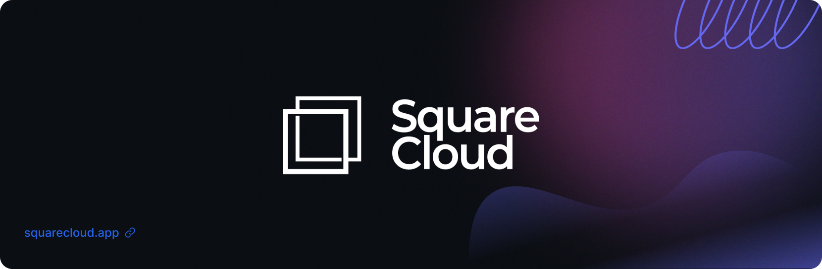
Banner
Versatile banner for use in GitHub repositories and other platforms. Best quality with background.webp. For a more compact size, use github-readme.png

background.webp (Recommended)
High quality for repositories and documentation
README.md